For this task we had to produce 3
promotional materials for an unsigned artist, as a group of 4, comprising of a
music video promo, CD digipak, and a music magazine poster. The purpose of
these is to promote and advertise the song and artist in a way that is
appealing to their and the genre’s audience. The promo itself is a music video
used to promote the release of the song and link itself and the artist to a
genre, ours being the Alternative/ indie genre so the music promo had to follow
the conventions of that genre. The digipak is a way of marketing the song as a
collector’s limited edition packaging so that rather than having a traditional
album cover, the audience gets even more features with the product, overall
making it more appealing to buy. We created a digipak that links with our music
promo and artist whilst following the conventions of the genre. This was to
make it appealing to the niche audience of the genre as well as being able to
appeal to audiences from other genres who may want to listen to the song, even
if it’s not in their preferred genre. The advert is used to promote the artist
and release of the song in a music magazine that has a larger, broader audience
so the advert must be able to be eye catching and appealing for people of
different demographics and psychographics, such as whether they like pop or
metal music or are from different socio-economic classes.
A music promo requires a repertoire
of elements if it’s to be successful. You must have elements of both
performance and narrative as both are important in making the video interesting
to the audience that are watching it. This also adds to the repeatability of
the video, which is important for audiences who would want to watch it more
than once. Music videos are adverts for the artists, not just for entertainment,
which makes them in a way similar to other adverts such as car adverts with
variety of shots, editing techniques such as specific cuts and transitions,
Mise en scene and sound. Narrative is the story line which illustrates,
amplifies or is a disjuncture of the song. Illustrating the song means the
narrative visually shows exactly what the lyrics say, amplification is where
the narrative follows the themes brought up by the lyrics, and disjuncture is
where the visual elements do not relate at all to the lyrics. This relates to
the genre as alternative/indie videos largely use amplification and disjuncture
in order to create conceptual videos that will interest the audience and have a
lot of relatable ideas and meanings. Our video is a mix of illustration and
amplification with some of the shots illustrating lines from the lyrics, such
as the shots of the actor lighting up a cigarette as the lyrics say “light up
another one”, and some shots just relating to the themes of leaving behind and
sadness. The narrative is also non-linear with it following the typical
chronological order of storyline, as ours jumps from the start and end
throughout the video. It is also an open-ended storyline as there is no
specific clear ending to the video. We chose to have a narrative like this as
it’s more meaningful as the storyline becomes much more relatable to more of
our audience by not being so clear cut. We linked our performance clips to the
narrative mainly in the illustrative parts of the promo in order to further
represent our singer’s star persona and image. This is conventional of the
genre as in many videos in the alternative and indie genre, such as tear in my
heart or high by the beach, use a mix of performance and narrative alongside
amplification and disjuncture.
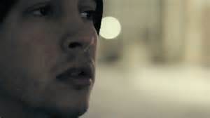
Camerawork was important as using a
lot of close-ups and extreme close-ups that contrast with mid shots and long
shots creates a dynamic and interesting promo, with specific details
contrasting the large open shots of the location. Overall this makes it more
engaging to the audience watching. Another way of making it more entertaining
to watch was to have fast paced editing that worked well with the camera work
and editing it to make the cuts match the beats in the instrumentals in the
song. The Mise-en-scene used was mainly props and locations that fit the time
period that we chose, the 50’s, such as using old jewellery and furniture or
filming in an old house. Overall our use of this repertoire of elements made
the video much more entertaining and engaging to our target audience as it was
specifically aimed at them with us following conventions specific to the genre.
We used a normal Mise-en-scene that most people have seen and had an actor who
is normal looking; she did not look like a celebrity. This was all in the aim
of making the video relatable to the audience.
The hybrid Indie/Alternative genre is
broad in the musical/performance styles and sound. Music and the promos range
from soft acoustics of Mumford and sons to the soulful, energetic music of
Patrick Stump. It’s hard to pin songs and artists to this genre due to how
varied it is, and just as hard to explain specific artists styles based on just
stating the genre. The genre literally means the music is independent
and different, but because there's such a range of conventions throughout the
genre, it’s hard to explain exactly what the alternative/indie music is. Bands
that really adhere to these conventions are Imagine Dragons, with being
different and independent with their own style of sound and promo whilst also
being relatable to their audience. However, other artists do subvert
conventions, such as Twenty One Pilots as they are more electronic and punky;
bringing conventions from other genres to the alternative/indie genre. The
importance of this is that it is an example of how the genre evolves through
the bands own style bringing new conventions to the genre. This meant that for
my promo I was able to choose from a huge range of conventions that I use to
create an original, appealing promo.

Lana
Del Rey’s “High by the Beach” promo influenced our own largely because of
setting and style of the visuals which are 50’s glam. Del Rey wears a long
white dress and she walks about a setting of a house on a beach. This connotes
the promiscuity and stardom associated with the 50’s and Del Rey herself has a
similar star persona as top what we wanted to give our artist
 Another
video that influenced us largely through visuals such as the camera work was
Goner by Twenty One Pilots. The promo is made up of close-ups and extreme
close-ups of the singer matched with specific lighting which is exactly what we
tried to do, however the lighting we used was much brighter in order to go for
a different style. Overall I feel these influences helped us achieve a more
engaging and exciting promo that looks professional.
Another
video that influenced us largely through visuals such as the camera work was
Goner by Twenty One Pilots. The promo is made up of close-ups and extreme
close-ups of the singer matched with specific lighting which is exactly what we
tried to do, however the lighting we used was much brighter in order to go for
a different style. Overall I feel these influences helped us achieve a more
engaging and exciting promo that looks professional.
Editing techniques that we used for
the video include matching the cuts to the beats within the instrumentals of
the song and using jump cuts. We cut all of our shots in time to the beats and
where the song has some double percussion beats we used jump cuts which
increased the pace of the video. This made it more interesting as for a slow
song we could increase the pace of the video. We also used overlay shots which
matched the beats also. This enabled us to use more footage and make some shots
much more interesting in contrast to if we had used those shots of their own.
Our
video is a mix of illustration and amplification with some of the shots
illustrating lines from the lyrics and some shots just relating to the themes
of leaving behind and sadness. The narrative is also non-linear with it
following the typical chronological order of storyline, as ours jumps from the
start and end throughout the video. It is also an open-ended storyline as there
is no specific clear ending to the video. We chose to have a narrative like
this as it’s more meaningful as the storyline becomes much more relatable to
more of our audience by not being so clear cut. We linked our performance clips
to the narrative mainly in the illustrative parts of the promo in order to
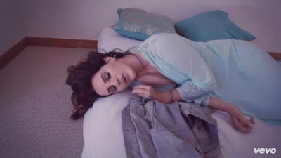
further represent our singer’s star persona and image. There are also three
performance settings such as the conservatory, the bedroom, outside the house
and the beach. The use of different locations gives a variety of interesting
shots that are more engaging than if we had used just one location.
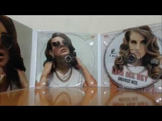
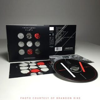
Our Ancillaries were influenced by other
digipaks and adverts such as Lana Del Rey’s and Twenty One Pilots. Both of
these artists use shots of themselves or other people as the highlight of their
digipaks and posters and also use key images that fit with their star persona
such as locations, styles and symbols shown below. This influenced us to use
images of our actor face on and images and key props to build up a start
persona for them that fit with the style of our music video.
Our digipak uses shots of our
artist, most importantly the close up on the front cover and advert, which is
conventional with how artists like Lana Del Rey and Halsey use close ups and
mid shots on the front covers of their albums. This is because they want to
show off their star persona, creating themselves a recognisable image for their
target audience which is what we wanted to achieve. We also used a lot close
ups of Mise-en-Scene used to show the time period of the video, which is the
50’s, denoted through old themed props such as statues and jewellery. This is
conventional as props are key in many alternative/indie music videos such as
Twenty One Pilot’s “Stressed Out” where Big Wheel bikes are used as a
representation of childhood.
Theories that our video follows are
Andrew Goodwin’s Music theory. This includes how our video is illustrative and
amplifies the lyrics of the song. This is through the general amplification of
the lyrics but with specific lyrics, for example “light another one up” being
shown through lighting up a cigarettes. Our actor has a star persona that
matches with the style of the promo, being a 50’s pretty girl who’s suffered
heartbreak, which is conventional with most alternative indie artists having
their own star persona, for example Lana Del Rey with her “risk taking, pretty
girl” look and Tyler Joseph from twenty one pilot’s “Blurry Face” or balaclava
Look. This made our video more entertaining as the audience has a character
that they can relate to and identify and the video is clear in what it is
trying to show and communicate to the audience.